Data interpretation and insightful visualizations

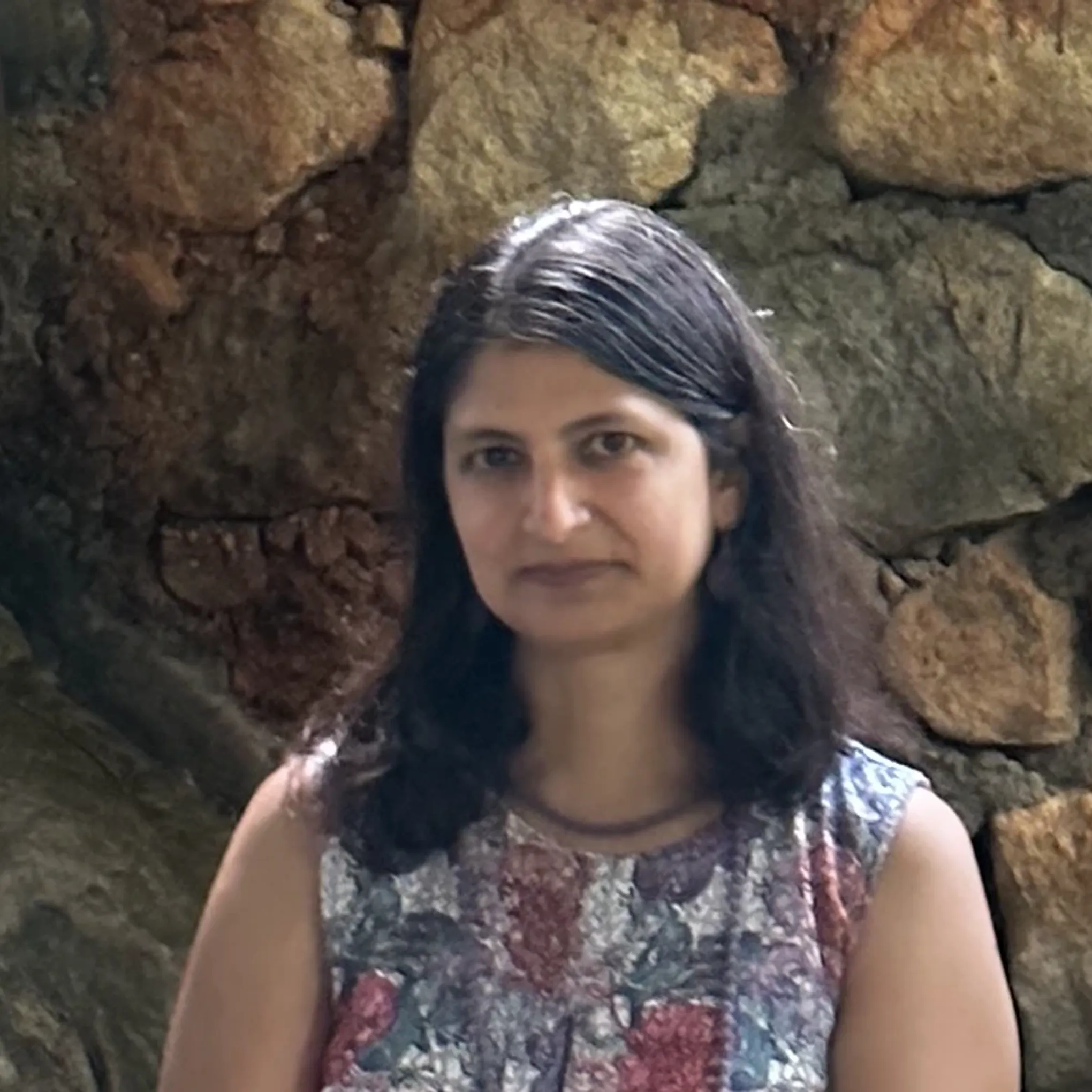
Surabhi Srivastava
Rising health and climate issues put a spotlight on the urgent need for effective science communication. I have been a bench biologist for nearly two decades, and am now exploring the nuances of data visualization. My posts are about building vizzes that can communicate scientific data to non-academic audiences. Some are a personal take from earlier work at the Centre for Cellular and Molecular Biology, Hyderabad while others focus on challenges related to biodiversity and the natural sciences posted - and generously reviewed - by the dataviz community. In line with my current interests at the Tata Institute for Genetics and Society , Bengaluru, I strive to achieve societal impact via knowledge sharing.

Saurabh Gaur
I strive to create a world where data can be clearly seen, understood, and used to make informed decisions for the improvement of all life on this planet. I enjoy working with both simple and complex datasets to create evocative visuals that drive recall and action. Know more about me at saurabhgaur.in